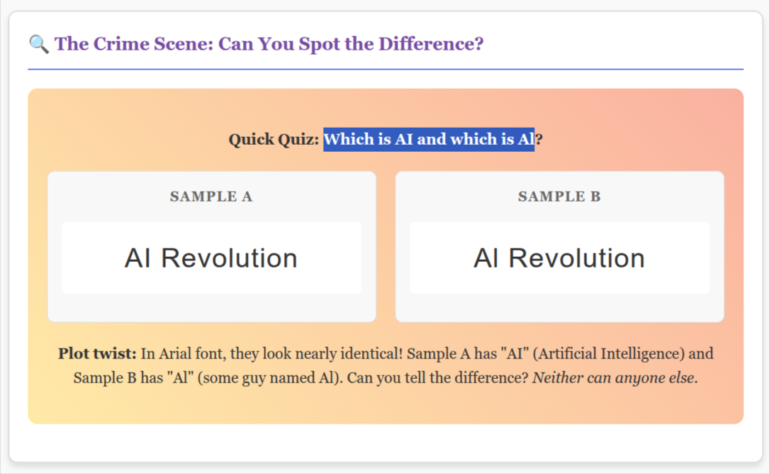
Doctor Who: It's not AI it is Al!!! (AL with small L letter, a dude named Al )
How one tiny letter turned artificial intelligence into some dude named Al, and other font fails that'll make you laugh-cry
Picture this: You're deep in a heated online debate about whether the Cybermen could defeat modern AI systems. You've crafted the perfect argument, hit "post," and then... horror. Your brilliant analysis of "AI capabilities" has somehow transformed into a discussion about "Al's capabilities."
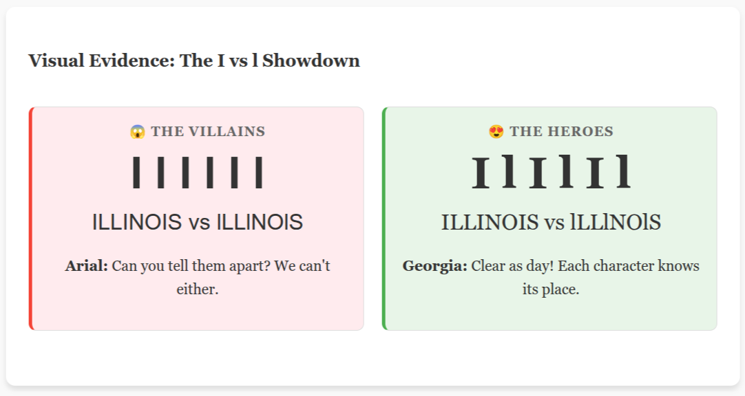
Congratulations! You've just been typography-slapped by the universe's most annoying font feature: when uppercase "I" looks exactly like lowercase "l."
The Birth of Al (Not That Al)
Somewhere in the depths of sans-serif font hell, a designer made a fateful decision: "You know what? Let's make these two completely different letters look EXACTLY THE SAME. What could go wrong?"
EVERYTHING, KAREN. EVERYTHING.
Font Crimes Against Humanity
The Al/AI mixup is just the tip of the typographic iceberg. Behold, a rogues' gallery of font fails that plague our daily lives:
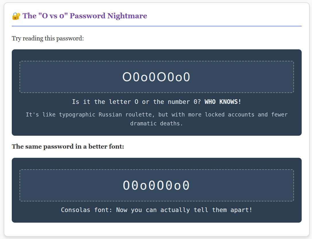
The "O vs 0" Nightmare
Try reading this password: O0o0O0o0 Is it the letter O or the number 0? WHO KNOWS! It's like typographic Russian roulette, but with more locked accounts and fewer dramatic deaths.
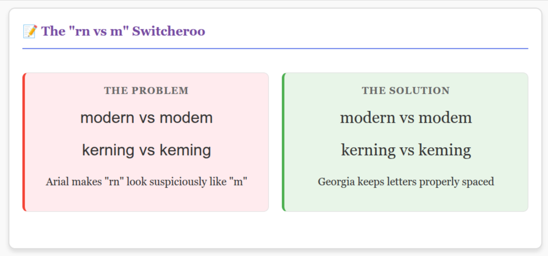
The "rn vs m" Switcheroo
The word "modern" can look suspiciously like "modem" in certain fonts. Suddenly your hip design blog sounds like it's stuck in 1995, discussing dial-up speeds.
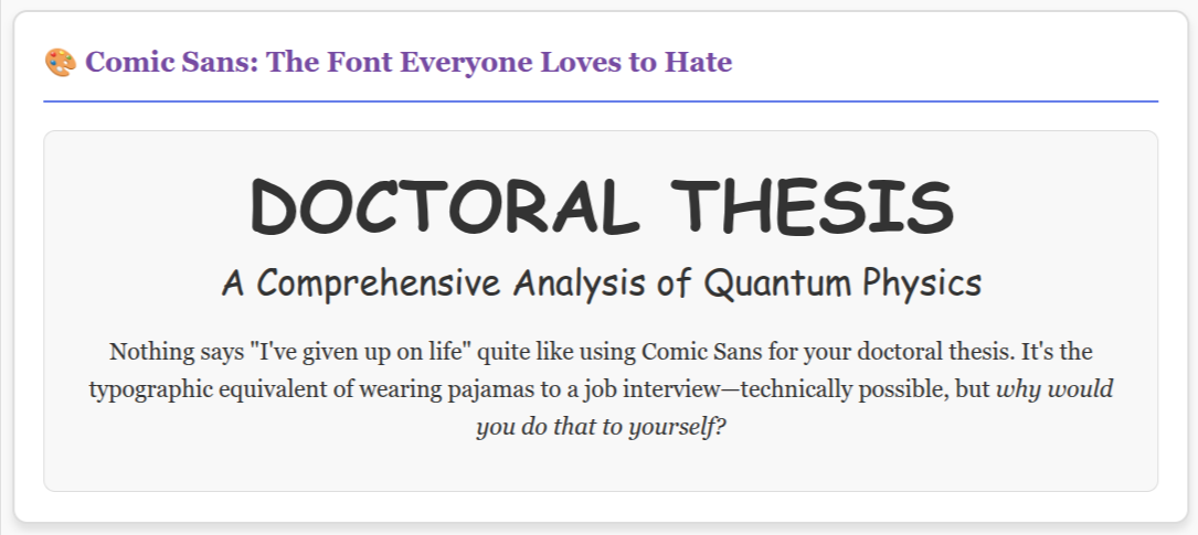
Comic Sans: The Font Everyone Loves to Hate
Nothing says "I've given up on life" quite like using Comic Sans for your doctoral thesis. It's the typographic equivalent of wearing pajamas to a job interview—technically possible, but why would you do that to yourself?
The Science of Why This Matters (No, Really!)
Here's the thing: your brain is basically a pattern-recognition machine that's been optimized for survival, not for deciphering whether that squiggly line is an "I" or an "l." When fonts mess with these patterns, your brain throws a tiny tantrum and goes, "NOPE. NOT TODAY, SATAN."
Research shows that:
- People read 12% slower when fonts have poor character distinction
- Your stress levels actually increase when dealing with hard-to-read text
- Bad typography can make you judge content as less credible (yes, even if the content is objectively brilliant)
The Heroes (Fonts That Don't Hate You)
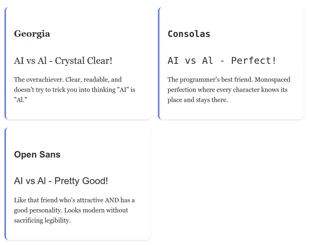
Georgia: The overachiever. Clear, readable, and doesn't try to trick you into thinking "AI" is "Al."
Consolas: The programmer's best friend. Monospaced perfection where every character knows its place and stays there.
Open Sans: Like that friend who's attractive AND has a good personality. Looks modern without sacrificing legibility.
The Villains (Fonts of Mass Confusion)
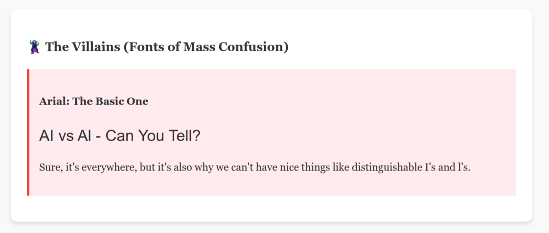
Arial: The basic one. Sure, it's everywhere, but it's also why we can't have nice things like distinguishable I's and l's.
Helvetica: Arial's sophisticated European cousin with the same identity crisis problems.
Any "Ultra Condensed" Font: These fonts are basically anorexic letters that have been squeezed through a digital pasta maker. Just... don't.
Typography Rules That'll Save Your Sanity
Rule #1: The Squint Test
If you have to squint to tell the difference between characters, your font choice is bad and you should feel bad.
Rule #2: The Parent Test
If your 60-year-old parent can't read it without their reading glasses, reconsider your life choices.
Rule #3: The 3 AM Test
Will this font still make sense when you're reading it at 3 AM with dry eyes and questionable life decisions? If not, hard pass.
Rule #4: Context Is King
Comic Sans for a funeral program? No. Times New Roman for a trendy café menu? Also no. Wingdings for literally anything meant to be read by humans? ABSOLUTELY NOT.
The Doctor Who Connection (Because Everything Comes Back to Time Travel)
The BBC actually nailed this with the current Doctor Who logo. It's custom-designed, slightly alien-looking, but still completely readable. They understood something crucial: when you're trying to communicate across time and space, clarity matters more than being trendy.
Plus, imagine if the TARDIS interface used a font where "POLICE BOX" looked like "POLlCE B0X." The Doctor would probably regenerate from sheer typographic frustration.
Pro Tips for Typography Survivors
For Digital Text:
- Bump up that font size. Your eyes will thank you, and so will everyone over 30.
- White space is not your enemy. Let your letters breathe!
- Dark text on light backgrounds > light text on dark backgrounds (fight me, dark mode fanatics)
For Print:
- Serif fonts are your friends for long-form reading
- Left-align body text (centered text is for wedding invitations and poetry, not paragraphs)
- If it looks good when printed on your terrible home printer, it'll look good anywhere
The Bottom Line
Typography isn't just about making things "look pretty"—it's about respect. Respect for your readers, respect for your message, and respect for the poor souls who have to decipher whether you're talking about artificial intelligence or your Uncle Al's weekend barbecue plans.
So next time you're choosing a font, remember: with great typography power comes great responsibility. Use it wisely, or risk unleashing Comic Sans upon the world.
And always, ALWAYS make sure your "AI" doesn't accidentally become "Al." The robots are scary enough without the confusion.
Written in a font where I's look like I's and l's look like l's, because we're civilized people here. Unlike those monsters who use Arial.
P.S.: If you made it this far without your eyes bleeding, congratulations! You've just experienced the magic of good typography. You're welcome.


